Positioning, message architecture, identity and the market facing experience. The half of the engagement that decided what was being sold, before anyone could design how to sell it.
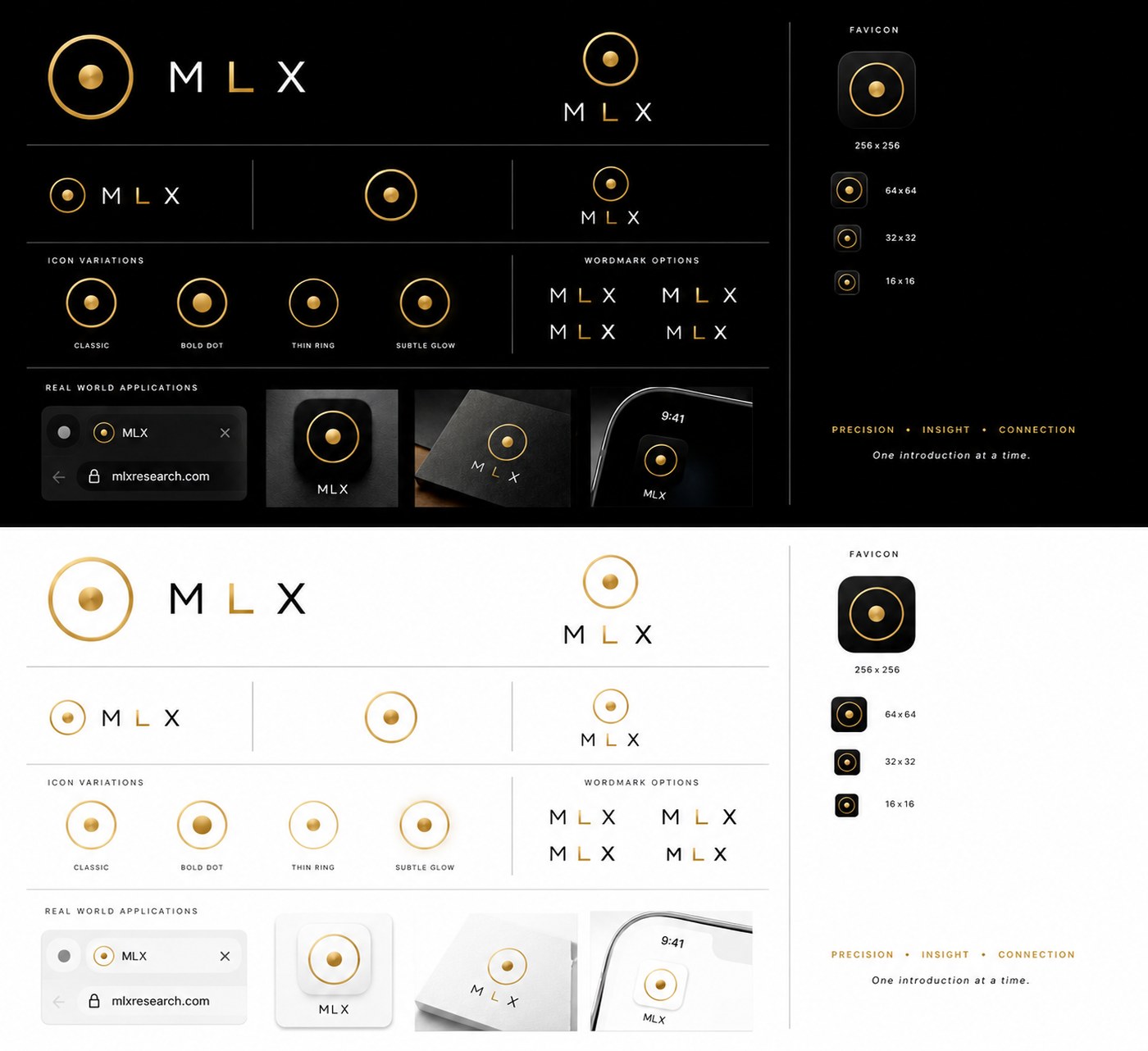
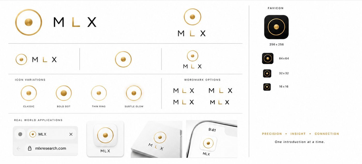
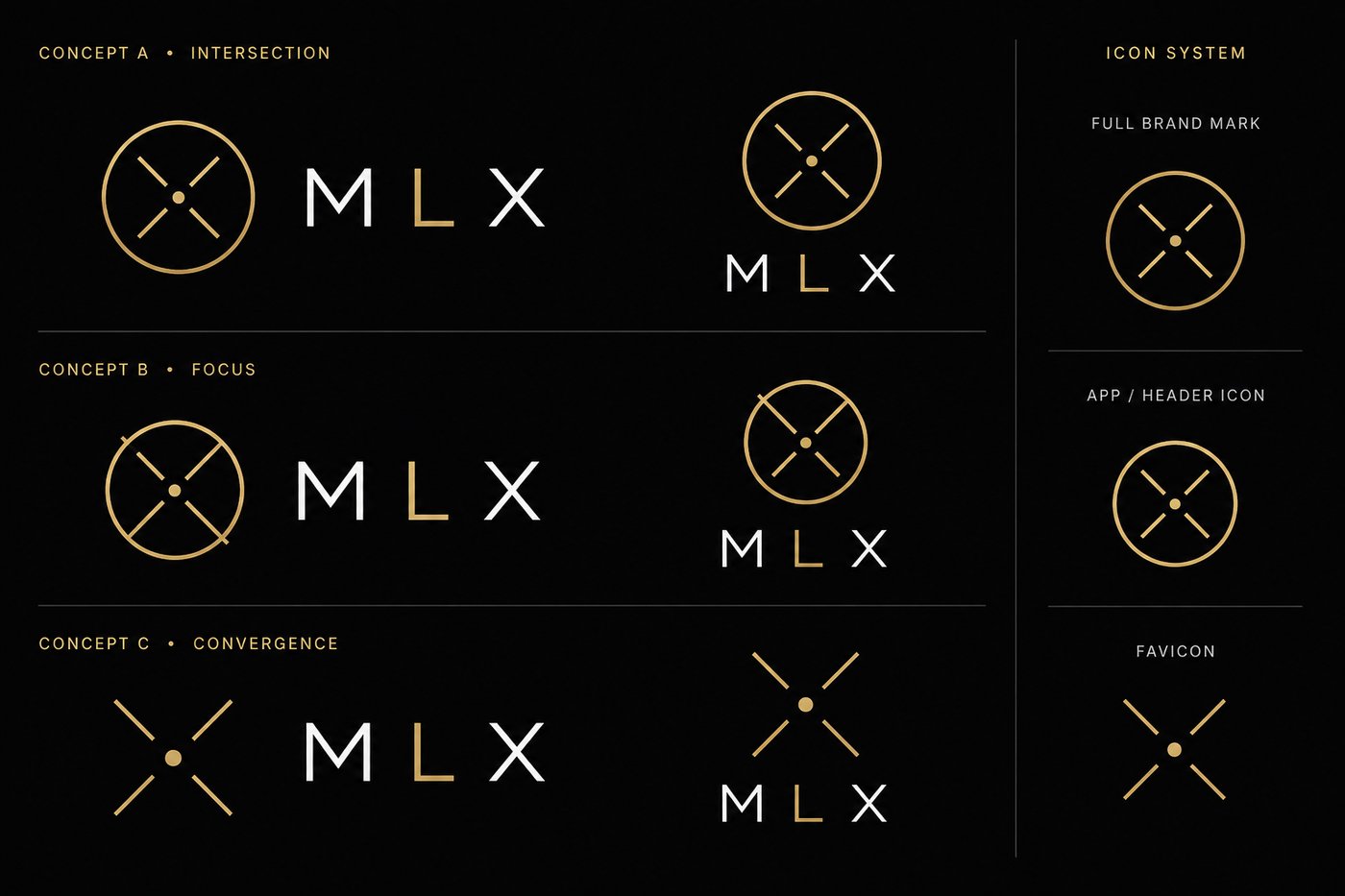
Fraunces at 600, letter spacing 0.16em, the L in brand gold and everything else in ink. Six gold tokens exist in the system and exactly one of them is ever allowed near the mark.
Contacts are abundant and ordering is scarce, so a database is the wrong noun. Remove the person from the loop and the value goes with them, so full automation is the wrong verb. Trust arrives in two sentences, so a feature list is the wrong artifact. What is left is a company that sells timing and access, evidenced.
The best businesses are often never listed.
They are quietly available, to one person, for about six months, and then they are not. Nothing is published, because nothing needs to be. That is the world the buyer operates in, and it is true whether or not this company exists.
Buyers are not short of companies or data. They are structurally late.
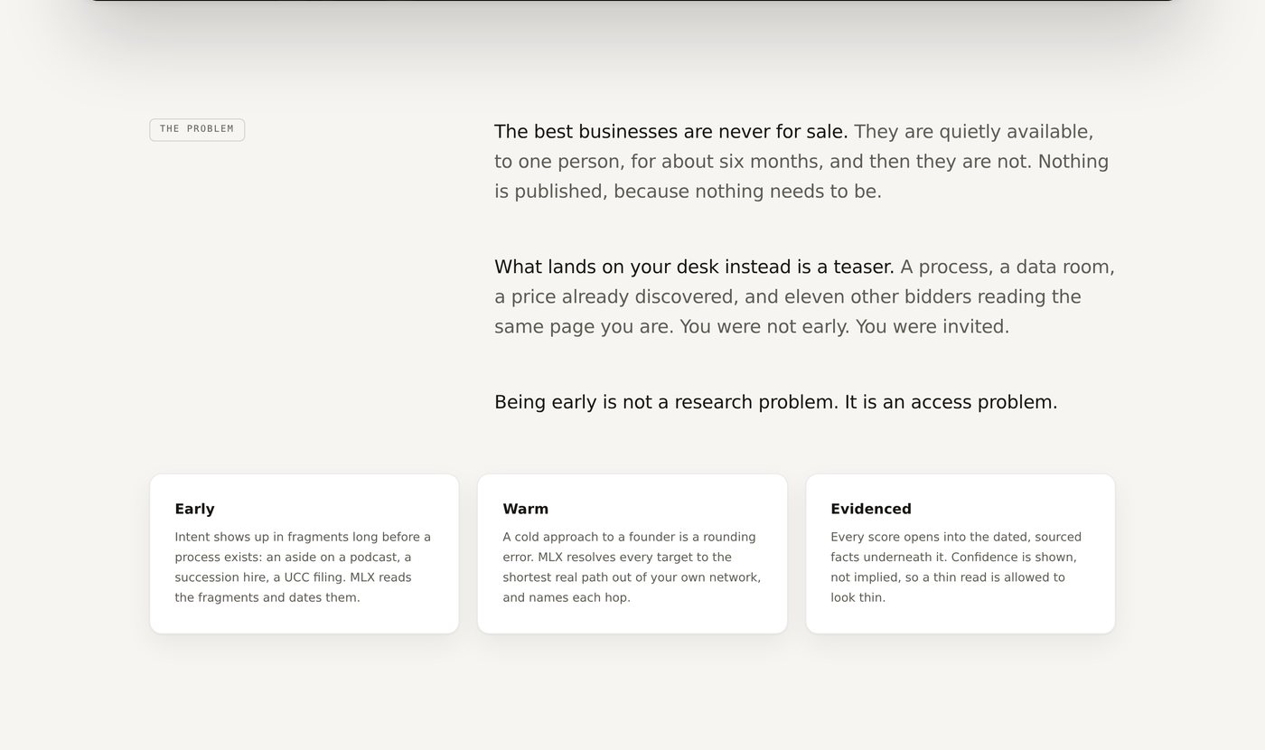
What lands on the desk instead is a teaser. A process, a data room, a price already discovered, and eleven other bidders reading the same page. You were not early. You were invited. The moment at which a deal is winnable has usually closed before anything reaches anyone in writing.
Timing and access, evidenced.
A statement about the world rather than a claim about a product. A sceptical reader can agree with it before deciding anything about the company, and once they have agreed, a database is visibly not the answer. They reach that conclusion themselves.
Trust first research, intelligence and advisory.
Not another AI software narrative. A client has to believe five things at once: that the information is credible, the analysis valuable, the opportunities real, the handling discreet and the organization trustworthy. What earns that is not a feature list. It is comprehensive signals read by proprietary analysis, and the ability to show where every read came from. Beyond premium, this is a story about trust and traceability, which is why the product shows its sources and lets a person override any of them.
The obvious move was to brand what the technology plainly was: a private market intelligence platform. Modern, scalable, legible to an investor, and the route the engine itself argued for.
It would have put the company into a comparison set it could not win. A buyer pricing a database prices it against the databases they already pay for, and the honest answer at that moment was that the company had less coverage and less history than any of them. The differentiated thing was not the corpus. It was a claim about timing and access that a database category has no language for.
I could argue that from a whiteboard. I could not prove it. That is what discovery was for.
One shared question spine across every conversation, with a role specific middle section, so answers stayed comparable across segments instead of accumulating as anecdotes. Every script carried the same five wedge tests, and each one was designed to break a hypothesis rather than confirm it. If the answers had come back flat, the positioning would have had to change, and I said so before I started.
Across the roles that touch a private market transaction from different sides. Participants described by role only.
One shared structure, four role scripts hanging off it: buyer, advisor and banker, investor and allocator, seller and founder.
Is a predictive signal believable at all. What is the trust bar for a new provider. Tool or done for you. Would you connect your own email and calendar. And the magic wand.
I walked in believing the product was a better way to find companies and people. One sentence ended that.
Control F does not differentiate. I need something that gives me a prioritization.Deal distribution lead, discovery
He was not short of contacts. He had thousands, built by hand over years, and he could search them instantly. His complaint was that search returns everything and ranks nothing.
The scarce thing was not the row. It was the ordering of the rows, and the reason for the order. That is not a better database. It is a different product, in a different category, making a different promise.
Discovery, not search. Ranked, never searched.
The strategy document says it in five words: most platforms help people search, this one helps people discover. That verb choice is load bearing on every page, and everything downstream on this page follows from it. I would not have got there from the engine.
If you try to automatize without being very closely connected through a person, you are losing 60% of the power.Investor operations, discovery, paraphrased
I had been treating human approval as a transitional compromise, the kind of thing you keep in version one and quietly automate away in version three. He described it as the location of the value.
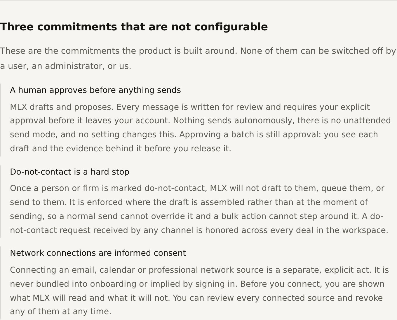
What it changed. Human accountability became part of the brand promise. It is the third clause of the promise line, beside early beats late and warm beats cold, and it is stated in market as a commitment rather than as a mechanism. What it changed inside the software is Part Two.
When it comes to people's money, it is all about trust. The message has to be two sentences or less or else you are going to lose them.Fundraising principal, discovery
Trust ahead of capability, which told me the brand had a job before the product did. Then a hard constraint on the form that trust arrives in. Not a page, not a deck, not a dashboard. Two sentences.
What it changed. I treated it as a specification rather than a preference. It is why the hero of the finished site is one sentence and a fragment, why there are five pillars and not nine, why the public site carries a single call to action, and why every ranked company on the live proof surface carries a short written reason rather than a chart.
A compliance bound advisor said he would rather submit his criteria and receive curated results back than connect his own email and calendar to anything. Not because he distrusted the technology. Because of what his compliance posture allows him to connect.
That could not be solved with copy. It is the clearest case on this engagement of research changing what was being sold rather than how it was described, and it is why the offer has two named halves today. A managed offering had to exist commercially, which is a positioning fact. What that offering had to be as a product path is Part Two.
One further input came from a working session with the technical co founder rather than from an interview: what the company itself could carry. The decision to lead publicly with buyers rather than with every side of a transaction follows directly from it. Customer conversations tell you what people need. They do not tell you what your own company can actually carry. The scale constraints behind that sentence are product constraints, and they are in Part Two.
The alternatives are on this map because they were evaluated, not because they make the selected position look better. Each one is a real business that real companies run today, and one of them is the route the technology itself argued for.
The rejected route sits in the same quadrant the company eventually occupied, which is the part worth noticing. The disagreement was never about where the value is. It was about what promise the company could defend on the day it made it.
The buy side acquirer, paying for qualified conversations rather than for a dashboard.
The best businesses are never listed. They are quietly available, briefly, to whoever is already in the conversation.
You are not short of companies and not short of data. You are structurally late, and eleven other bidders are reading the same page you are.
Timing and access, evidenced.
Most platforms help people search. This one helps people discover. Ranked, never searched.
Early beats late. Warm beats cold. A human stays accountable for every approach.
Round one settles what kind of company this is. Round two settles how it presents. Running them as a single workshop is how a positioning exercise ends up arguing about adjectives while the actual disagreement, service or software, stays untouched underneath. I wrote the done condition before starting round two: two to three directions ready to discuss and narrow, not one recommendation dressed as inevitable.
Round one. Pros and cons written down for each before any route work began.
Round two. Each carrying a naming logic, a position, a tone, a visual direction, trust signals, and what it must not feel like.
Three positive tests and three negative tests. A brand exercise that only asks what a route should be will approve almost anything.
Trust first research, intelligence and advisory, with its cost written down before it was recommended.
For: trustworthy, professional, broad applicability. Against: safe reads as generic, and generic is invisible in a market that runs on reputation. It also gives away the timing claim, which is the only thing the company had that nobody else did.
For: modern, scalable, technology forward. Against: may require proof. That is the polite version. It creates a promise the company would have had to defend immediately, in front of a comparison set of established providers who cover more and price lower.
For: highest trust, matches the early business model, service first. Against: less scalable perception. Chosen anyway, because the primary obstacle in this market was never technology.
The strategy record names five things a client has to believe before anything else can happen: that the information is credible, that the analysis is valuable, that the opportunities are real, that the handling is discreet, and that the organization is trustworthy. Underneath that sits a chain rather than a funnel. Credibility creates trust, trust creates conversations, conversations create opportunities, and opportunities create revenue and referrals. Referrals feed credibility again, which is why exclusivity became a strategy rather than a pose: the cheapest growth available to this company is being worth introducing.
That is the whole reason the strategy documents describe the brand as a trust asset rather than as a marketing asset, and it is the reason the brand had a job before the product did.
The route the technology argued for. Modern, scalable, legible to an investor. Rejected because it creates a promise the company would have had to defend immediately with proof it did not yet have, and because it invites a comparison set of established data providers, all of whom price lower and cover more. This is the route I would have picked from a whiteboard, and the discovery is what stopped me.
Trustworthy, professional, broadly applicable, and genuinely safe. Rejected because safe reads as generic, and generic is invisible in a market that runs on reputation. It also gives away the timing claim.
The most distinctive of the five and the most dangerous. It puts the mechanism in the name, which invites exactly the question the company will not answer, and it sits one word away from the surveillance vocabulary the messaging rules explicitly forbid.
Closest to the customer's own vocabulary and the easiest to explain. Rejected as the primary posture because platform pulls the whole story back into software at the exact moment the business was being run as a service.
A real commercial route, since a meaningful share of end users may only ever meet a partner's brand. Rejected as the public posture and kept as a constraint on everything else: whatever won had to survive being invisible behind someone else's front end.
Chosen because the primary obstacle was never technology. A client has to believe the information is credible, the analysis valuable, the opportunities real, the handling discreet and the organization trustworthy. A software narrative asks for a different kind of belief, and asks for it too early.
Three positive tests and three negative tests, deliberately. The white label criterion is the one nobody expects on a positioning scorecard, and it is the one that quietly killed the most confident route, because a posture that only works when your logo is on the front is not a posture, it is a launch plan. The field that did the most work inside each territory was not the position or the tone. It was what it should not feel like. That is where most of the rejections actually happened, and the deciding question was never which route was most ambitious. It was which one a private market buyer would believe from a company with no track record.
That cost was written down as the argument against the option I was recommending, not discovered afterwards. To a technical evaluator the public site under sells the engine, deliberately. I accepted that because the buyer is not a technical evaluator, and because a company that leads with its most impressive asset in this market is describing a mechanism its audience has already decided to be nervous about.
I would make the same call again, and I would not pretend it was free. A strategy recommendation with no stated downside is a recommendation nobody has stress tested.
The category was not settled by taste. It was settled by a line already sitting in the commercialisation record: the company does not monetise data, it monetises opportunities, introductions, meetings and transactions. Revenue is activated when an opportunity, an introduction or a meeting is delivered, not when somebody logs in. A brand built on that sentence cannot lead with a database, and it cannot lead with a login either.
The same document sets the growth posture in four words that I treated as a design brief rather than as a slogan: narrow before broad, trust before scale. It is why the public site has one open audience, one call to action and no pricing. The strategic edge is recorded in the same place: defensibility lives in the downstream partner network rather than in the software, and relationship intelligence tooling is an established, well funded category where features alone will not win. A brand that led on features would have walked the company into a category fight it was not funded to win, against opponents whose feature lists were already longer.
The ideal customer profile is narrower than the audience list, and holding both at once without blurring either is most of this job. The ICP is the buy side acquirer: someone carrying a small number of concurrent pursuits, who wants companies that are not listed and a warm route to the person who decides, and who is paying for qualified conversations rather than for a dashboard. The business record states the relationship exactly. The buyer is the primary wedge, and the others are secondary intake paths into the same opportunity flow, not five co equal segments.
Buyers and acquirers, sellers and founders, sell side brokers and advisors, buy side brokers and bankers, investors and allocators. Five orders of emphasis on one architecture, and no second vocabulary to maintain.
The buy side acquirer became the primary public audience. Sellers, investors, divestitures, brokers and advisors remained part of the broader opportunity model but were intentionally not presented as co equal public audiences. They are named on the page and explicitly marked by invitation. Naming the other five proves the ambition is real. Marking them closed proves the focus is real.
Five is an audience decision. One is a positioning decision.
| User type | What they want | What they fear | What the brand has to say differently |
|---|---|---|---|
| Buyer and acquirer the ICP | Good companies nobody else knows about, owners who are ready or can be moved to ready, a warm path in, and qualified conversations rather than dashboards. | Being late. Being one of a hundred cold approaches. Capital sitting idle while the good deals happen in rooms they are not in. | Lead with the moment, not the company. Ranked, never searched. This is the reader the entire public site is written for. |
| Seller and founder | Strategic options for growth, capital or an exit, and the right buyer rather than the fastest one. Preferences that are theirs to set, including who they will and will not sell to. | Valuation. Confidentiality. The wrong buyer. The time the whole thing takes. | Discretion before advantage. The noun is options, not opportunities, and nothing moves without them. This is the audience where a promotional register would do the most damage. |
| Sell side broker or advisor | Qualified sellable companies routed into an advisor network, and a way to source and qualify that does not cost a week per mandate. | Losing control of a lead, of client access, or of a network built over years. Being disintermediated by the tool they let in. | This arrives under your brand, not instead of it. It is why the identity had to survive being white labeled. |
| Buy side broker or banker | Mandates sourced on both sides, the right person at the firm, a few personalized opening lines, and something that prioritizes rather than searches. | Fee attribution disputes. Servicing load. A book of concurrent deals carried in a tool designed for a handful. | Deal desk register, never instructional. This is the audience that decided the offer would be named Direct Access and Full Service rather than anything that sounds like a software tier. |
| Investor and allocator | Opportunities aligned to a thesis and to an existing network, and a fix for the specific thing their current sourcing misses. | The spread between a good manager and a bad one. Compliance exposure on connected email, calendar and network data. | Lead with the security page, not the capability. The recorded finding is that the objection is compliance and security, not distrust of the technology. |
Every row is drawn from the structured intake and the discovery scripts rather than from invention. One architecture, five orders of emphasis, and no second vocabulary to maintain. Nobody has to write a second brand for the founder audience. They change which pillar opens the page.
The strongest argument for a premium register in this market is defensive, and it is written down in the strategy record. Looking too public or too promotional reduces credibility, and minimal, exclusive and serious positioning beats conventional demand generation. Read that carefully, because it reverses the usual logic. Volume marketing here is not merely inefficient. It is evidence against you. Reach is a cost, not an asset.
No tier menu, no self selection, no instant sign up. One form, and a person decides the right engagement after reading it.
The managed half is an engagement where a person owns the outcome. That is the promise. How the software enforces it is Part Two.
Reveal outcomes, not methods. Sources are not disclosed and model construction is not explained. Restraint here is the attribute a private market buyer is actually shopping for.
The public site carries no pricing at all, and that is a positioning decision rather than an oversight. A brand that claims a premium register and then publishes a seat price has already agreed to be compared on the seat price. The qualifying happens in the request conversation, which is where a mandate sized engagement belongs.
Underneath it, the shape of the model was settled by evidence rather than by ambition. A prospective user, a compliance bound advisor with small cheque sizes, treated the tool as an acceptable share of what they earn using it. That single data point answered a question of shape and not of amount: pricing scales with the user and with the size of the deal rather than sitting flat by seat. It is one data point and it is labeled as one. Premium and scaled are compatible. Premium and commodity are not, and the naming work made exactly that call when it threw out every pair that read as a software tier.
Everything above is the brand, positioning and marketing surface. The product behind the login sits in the platform case study, by request.
Open mlxresearch.com ↗Positioning tells you what to be. Messaging tells everyone else how to say it when you are not in the room, which in a partner led business is most of the time. The architecture is deliberately small, because a two sentence trust bar is not a stylistic observation. It is a size limit.
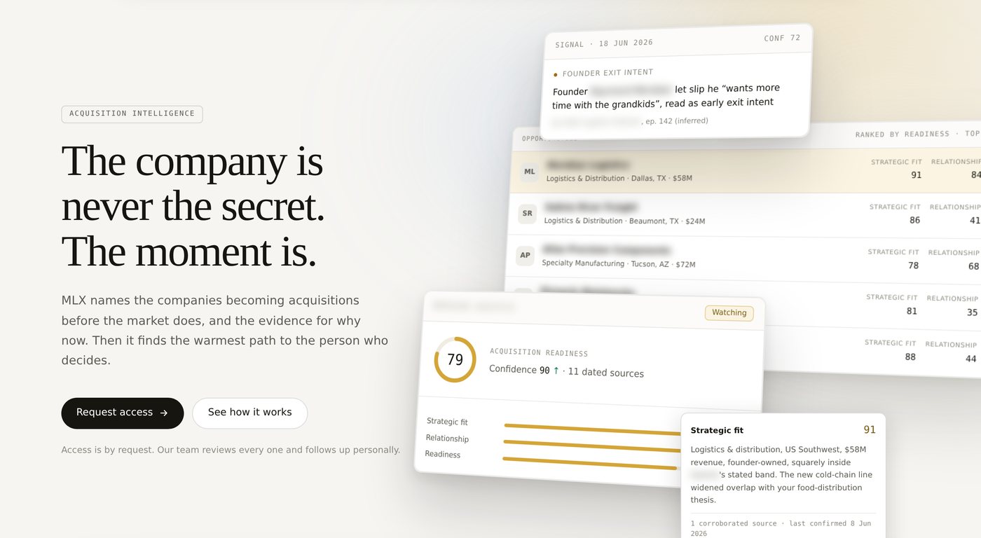
The company is never the secret. The moment is.
Find the right company, investor, buyer, seller or opportunity before everyone else does. With the right information. With the right relationships. At the right time.
No product noun, no technology, no category. It describes an advantage, which means it survives the company changing what it sells.
Early. Warm. Evidenced.
A dated read on what moved. A ranked set with the reason for the order. A path to the person who decides. A draft that sends nothing without your approval.
Access is by request. There is no public signup.
One call to action, no pricing, no logo wall, no chat bubble. In this market, looking too public reduces credibility, so reach is a cost rather than an asset.
A pillar with no surface is a slogan. Every pillar had to land on a specific piece of the public site or come off the list, and the mapping is what stops the architecture drifting into decoration. Discretion, the pillar most companies would leave off, is carried by two sections and an entire page. Note also what is absent: no pillar maps to a features grid, because there is not one.
The point is not that the words changed. Every phrase in the left hand column is a real category with real incumbents already in it, so each row is a competitive decision rather than a vocabulary preference. Read the column as a map of the fights the company chose not to have.
Category and vocabulary are two different jobs and are often confused. The doors above fix the category, which is a positioning decision. The list beside this fixes the vocabulary, which is an operational one. A partner can get the category right and still lose a deal by using one wrong word in a meeting.
Four of the ten forbidden terms are surveillance adjacent, marked in red. That is not squeamishness. The mechanism genuinely reads that way if it is described carelessly, and one careless sentence in this market is not a bad impression, it is the end of the conversation. The same rule later disqualified an entire family of logo concepts.
| Signal | We want to feel like | We must not feel like |
|---|---|---|
| Trust | Credible, trusted, discreet | Sales driven, promotional, hype focused |
| Social proof | Connected, well connected | Mass market, tool of the week |
| Quality | Sophisticated, high signal | Lead generation company, data broker |
| Value | Insightful | Surveillance language |
This is the table I hold a design against, because a page can pass the category test, pass the vocabulary test, and still fail row one by having three calls to action above the fold. That single row is why the public site has one call to action, no pricing, no logo wall and no chat bubble.
The company name was an open item on the contradiction list rather than a settled thing I inherited. The criteria were written before the candidates, which is the only way a naming exercise stays honest: professional, credible, timeless, premium, memorable, trustworthy, and flexible across buyers, founders, brokers and investors. Avoid trendy, consumer focused, crypto adjacent, buzzword heavy and overly technical.
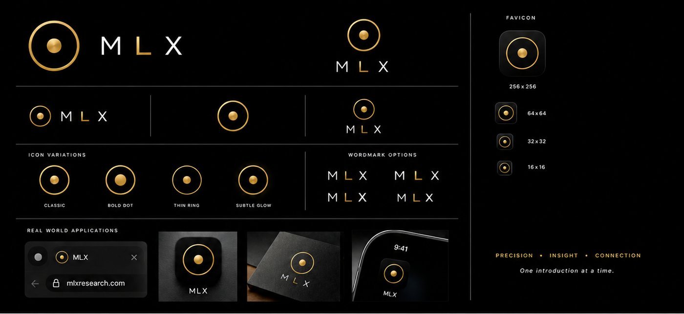
A three letter abbreviation won on the criteria most naming exercises weight last. It is legible at sixteen pixels, it carries no promise the company has to keep, it does not date, and it survives sitting quietly inside a partner's interface without arguing with their brand. A descriptive name would have failed every one of those tests, and a distinctive word name would have failed the last one. The near misses were near misses on letterform rather than on meaning, and the choice between them came down to which one had a center letter worth coloring. That is not a joke: the wordmark carries the brand gold on a single letter, so the letter in the middle is load bearing.
Naming the two halves of the offer looks like labeling. It is positioning, because what you call the two halves decides how a buyer prices them. Six pairs were proposed and rejected before the seventh was locked, each on a specific failure of register rather than on taste. Both are now presented at identical visual weight with no primary and secondary styling, which was a deliberate correction of an earlier design that quietly told the reader which one was the real product and which one was the consolation.
A three letter name is legible, timeless and white label safe, and it will never do any explaining. Every gram of meaning has to be carried by the line next to it, which puts permanent load on the copy and makes the message architecture load bearing rather than decorative. That is a real cost, and it is the reason this section exists at the size it does.
A dense analytical interface and a narrative, image led argument are not the same instrument. Forcing them into one language does not produce consistency, it produces one surface doing its job badly. A single unified system was the obvious alternative and it was rejected in writing with the reason attached, because a two system identity is the kind of thing a new arrival tries to unify in their second week with the best of intentions.

The public surface is warm off white, editorial photography, serif display type and sparse gold, because it is a narrative that has to be believed in two sentences. The application after login is gold on near black, dense and data forward, because it is read for an hour at a stretch by someone doing work.
Only enough of the dark register is shown here to prove the identity was designed for two contexts. The product experience it serves is Part Two.
Gold came out of a review of the competitor set, where the incumbents were uniformly blue. Purple was tried and rejected. Gold read as the one register in that market that was neither software blue nor luxury cliche, and it survived on a dark surface, which the product needed. Then it had to be disciplined, because a color chosen for distinctiveness becomes noise the moment it is used for everything.
Exactly three things, and all three must always be the identical value. The L had previously been a third gold, chosen when the mark was a different shape. With the mark and the wordmark now sitting nine pixels apart, two near identical golds read as a printing error rather than as a decision.
A second gold exists for interface accents only: focus outlines, score bars, small strokes. Where that accent is permitted at application level is a product governance question, and it is answered in Part Two. The rule set lives in a brand file with an explicit precedence line, when in doubt this file wins, because a rule with no tiebreaker is a suggestion.
This is governance rather than taste, and it is the only reason two registers can be maintained by more than one person. The same discipline decided two opposite answers that both had to be written down: at sixteen pixels a white backing makes the gold read and a dark tile mutes it, so the favicon is gold on white. A shared link is the opposite problem, where a large card lets the gold glow and matches the hero, so the link preview is dark. Different problems, opposite answers, both recorded so neither gets corrected later in the name of consistency.
Light marketing and dark product means two systems to keep honest, and the gold discipline is the only thing holding them together. A single system would have been cheaper and would have made one of the two surfaces worse. I would still choose the expensive answer, and I would not pretend the maintenance cost is imaginary.
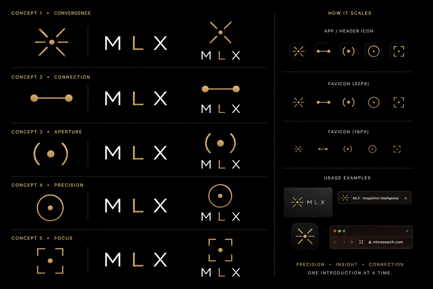
These are not weak drafts kept for contrast. Each one is a competent execution of a real idea, and each lost for a reason that can be stated in a sentence and then reused. A rejected direction you can put on screen is worth more in an argument than one you are recalling from memory.

Read the sixteen pixel row on its own and the shortlist writes itself. Convergence, a radiating burst, is beautiful large and becomes a smudge small. Connection, a line between two dots, holds at every size and says relationship, but it is a line between two dots, which is close to a dozen other logos in adjacent categories. Focus, a bracket frame, keeps its corners but reads as a camera control rather than as a company. Aperture is elegant and loses its arcs first.
Precision, a dot inside a ring, survives all four rows intact, and it is the only one of the five legible as a single idea rather than as a decoration: something specific, held inside something wider.

The product finds a specific point in a wide field, so a target is the obvious drawing. It was rejected for exactly the reason the messaging rules predict. A crosshair over a private company is surveillance imagery, and surveillance is one of the four forbidden terms on the vocabulary list.
The predecessor mark in the codebase was a reticle from the same family, and the fallback flag that could restore it was left in place, which is how close this came to shipping.

A brushed gold with a gradient sitting nine pixels from a flat gold letter reads as two different golds, which is the exact failure the entire discipline exists to prevent. It is kept as an export for large format use only, never as the product mark.
This is the one that keeps coming back, which is why the rejection is recorded rather than remembered.


A meaningful share of end users may only ever meet a partner's front end. That was written down as a brand architecture implication early, which is why white label safety sat on the positioning scorecard in round two rather than arriving later as a production requirement. The near term commercial need was partner facing enablement, not a broad public launch, and a brand that cannot disappear cannot serve it.
The mark leads. Full lockup, full voice, and the register is the company's own.
Someone else's brand leads and the mark sits quietly beside it at icon size, which is the test the sixteen pixel column was really for.
No mark at all. What has to survive here is not the logo. It is the register: the restraint, the vocabulary, the way evidence is presented and the refusal to oversell.
This is the reason a distinctive word name lost and a three letter abbreviation won, and it is the reason the mark is a shape rather than a picture of anything. A logo that argues with a partner's brand cannot be placed inside one. Considering it during positioning rather than during production is the difference between a system and a set of files.


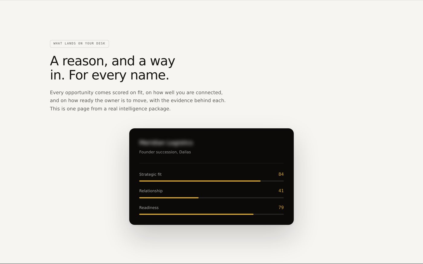
A reason, and a way in, for every name. One card instead of a feature list, shown in the product's dark register on a light page. It is the smallest artifact that can carry the whole promise of the company, and the buyer page is built around it rather than around a grid.
Photography direction was decided the same way the rest of this was, against references rather than against taste. Two were reviewed. One was adopted for its clean light mode, real cinematic photography and layered product proof. One was rejected on execution, an illustration style that read as campy rather than premium, and its confident literary copy voice was borrowed anyway. Taking the voice and refusing the visual is the part I would call the judgement.
Two complete marketing treatments were then built, light and dark, and compared on real screens rather than in a deck. Light won and became the public default. The dark treatment was preserved as a working comparison rather than deleted, because selected does not mean the other one was thrown away.
Eight sections in a fixed order, and the order is doing the persuading. Each one exists only to earn the right to the next, and each answers the objection a sceptical buyer raises at that exact moment. Move any block and it starts answering a question the reader has not asked yet, which is the mechanical definition of a page that feels like a pitch. Annotated below are the five places where the strategy is visible.
Lead with a truth about the buyer's world, not a product category.
Why. Refusing to name a category is the decision. The page opens with a fact a sceptical reader can agree with before deciding anything about the company, and once they have agreed with it a database is visibly not the answer. They reach that conclusion themselves, which is the only version of the argument that survives a specialist. The proof surface immediately beside the headline is the product's own ranked output, which answers the credibility test before the reader has finished the first screen.
Make lateness the enemy, not lack of data.
Why. The reader already has sources, so a section about information volume would be arguing with someone who has already won that argument. The problem is told as the reader's own week instead: what lands on your desk is a teaser, and eleven other bidders are reading the same page you are. Three cards carry the first public appearance of the pillar vocabulary, early, warm and evidenced, and the section closes on the reframe the entire positioning rests on.
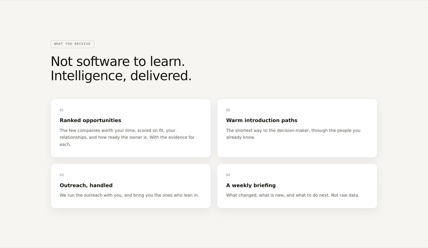
Describe deliverables, not software features. Not software to learn, intelligence delivered.
Why. This is the compliance finding rendered as a page rather than as a footnote. An advisor in discovery could not connect his own email and calendar, for compliance reasons rather than distrust, and that changed how the service had to be described for everyone. Four cards, each naming a thing the customer receives rather than a thing the customer operates, which is the difference between selling a service and selling a login. The page also states the arithmetic of the alternative: by the time a great company is for sale you are one of twenty buyers. Early stops being a mood and becomes the avoidance of a countable disadvantage.
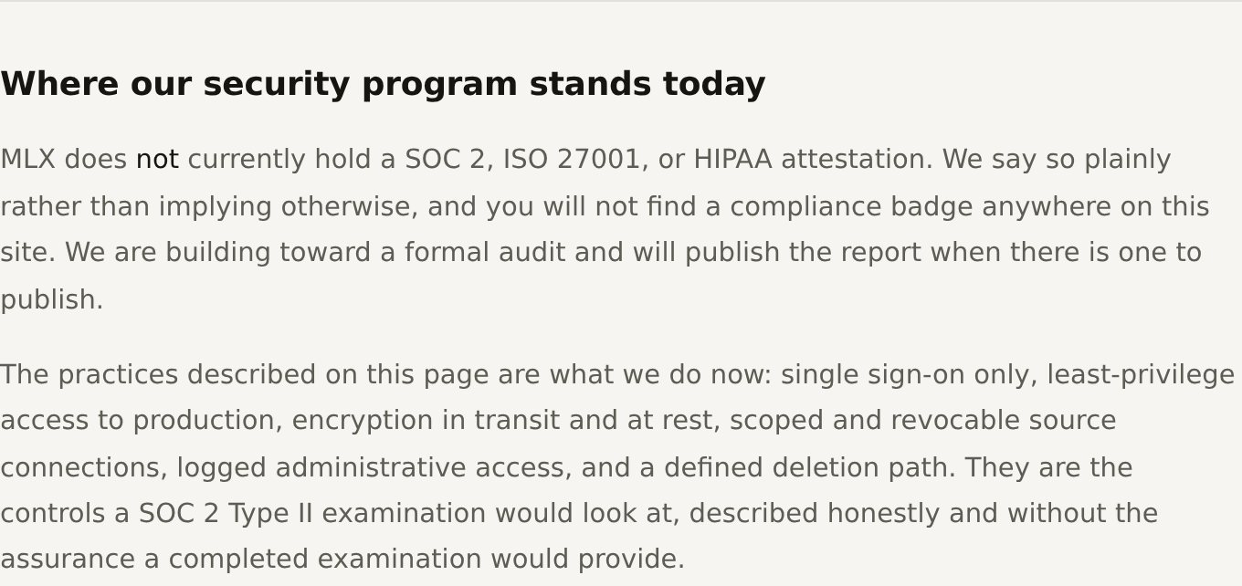
Credibility through disclosure, rather than borrowed authority.
Why. The page states plainly that the company does not hold SOC 2, ISO 27001 or HIPAA attestation today, and that no compliance badge appears anywhere on the site, then describes what is actually in place. The audience is compliance sensitive and will ask on the first call, so the brand tells them the truth before they catch the company avoiding the question. It also does something a certification cannot: it separates the buyers who need a badge today from the ones who can work with a young company, which is a qualification step disguised as a disclosure.
Exclusivity as a consequence, not manufactured scarcity.
Why. This was the most contested decision on the page. The instinct is to open with scarcity because it is the strongest thing the company has, and that is exactly why it closes. At the top, access by request is an unexplained velvet rope in front of a building nobody has looked at, and a sceptical buyer reads it as a technique. At the bottom, after the window has been established, the miss made concrete, the machinery shown and the safety addressed, the same sentence is a believable operating constraint the reader has already concluded for themselves.
The public door hides the fork. Direct Access and Full Service are locked vocabulary and live inside the product, but the request page shows a single gated door. Showing both paths publicly was considered and rejected on the record, because a visible fork reads as pick your tier, and a tier list is the fastest way to turn a reviewed relationship into a purchase. The cost is real: it removes self selection at the top of the funnel and puts more load on the review conversation.
Discretion limits proof. The rules forbid describing sourcing mechanics or naming partners, which is correct for the market and removes the two most persuasive things a young company usually shows: how it works, and who already trusts it.
These are recorded in the strategy document as unvalidated, and they stay unvalidated here. A case study that quietly resolved them would be telling you something the company does not yet know.
Earlier than what competitors surface is the central claim of the positioning. It is believed, argued, and not yet proven at scale.
One validated data point is one data point. Everything above it is an estimate, and it is labeled as an estimate in the source.
Whether exclusivity as a closing move outperforms exclusivity as an opening move is untested, and outcome instrumentation is still being built, so nobody can currently answer it with data, including me.
Three market questions, and they are the three this half of the work is accountable for. The rest of the open list is not resolved anywhere on this page either. It is carried in Part Two, because the questions on it are answered by the software or they are not answered at all.
Every claim in this register can be checked against the live surface it produced. Sourcing mechanics, scoring inputs and the confidence method are described in kind and never in numbers, because the client withholds them. No individual, firm, prospect or partner is named anywhere on this page. The product behind the login is not linked here.
These are things the company can now do that it could not do before, each one checkable against a live surface.
Three postures weighed, five routes rejected against six criteria, and the cost of the winner written down before it was recommended. The company can now say what it is not, which is the part that stops the positioning being reopened every quarter.
One north star line, five pillars, six category doors closed, ten terms forbidden outright, and a locked headline set. In a partner led business a brand is repeated far more often by people who do not work there than by people who do.
White label safety and legibility at sixteen pixels were positioning criteria, not late constraints. The mark holds inside a partner's front end, in a browser tab, on an app tile and on a card, and the register holds even where the mark is absent entirely.
One audience open, five named and explicitly marked by invitation. Naming the other five proves the ambition is real. Marking them closed proves the focus is real, in one component.
Outcome instrumentation is still being built, so these are delivered operational outcomes rather than statistics, and every one of them is verifiable against the live experience.
The marketing experience told customers what MLX could do. The platform had to prove it.
Positioning, message architecture, identity and the marketing experience. Light, narrative, image led. It creates interest and expectation.
Architecture, workflows, data, tools and the customer experience behind the login. Dark, dense, operational, data oriented. It creates utility and retention.
Same mark, same gold, same restraint principle, two different jobs. The identity is the only thing that crosses the door, and it crosses it deliberately.
Platform strategy, information architecture, the core buyer experiences, the product system, and the diagram that brings both halves back into one MLX experience. It runs on demonstration data and is opened by request.
Request access →A category chosen against evidence, a message architecture small enough to be repeated by people who do not work here, and an identity built as a trust asset.